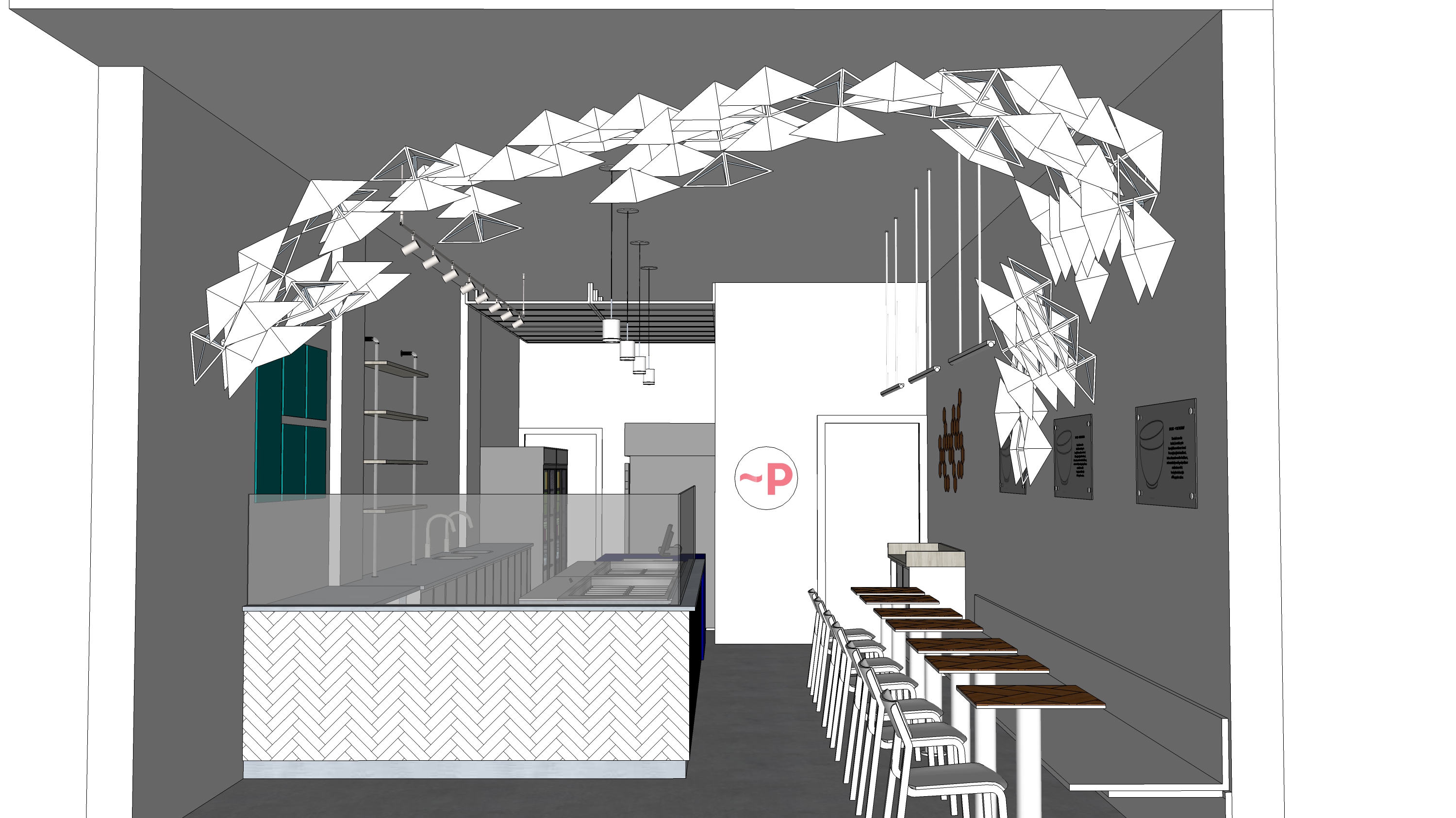
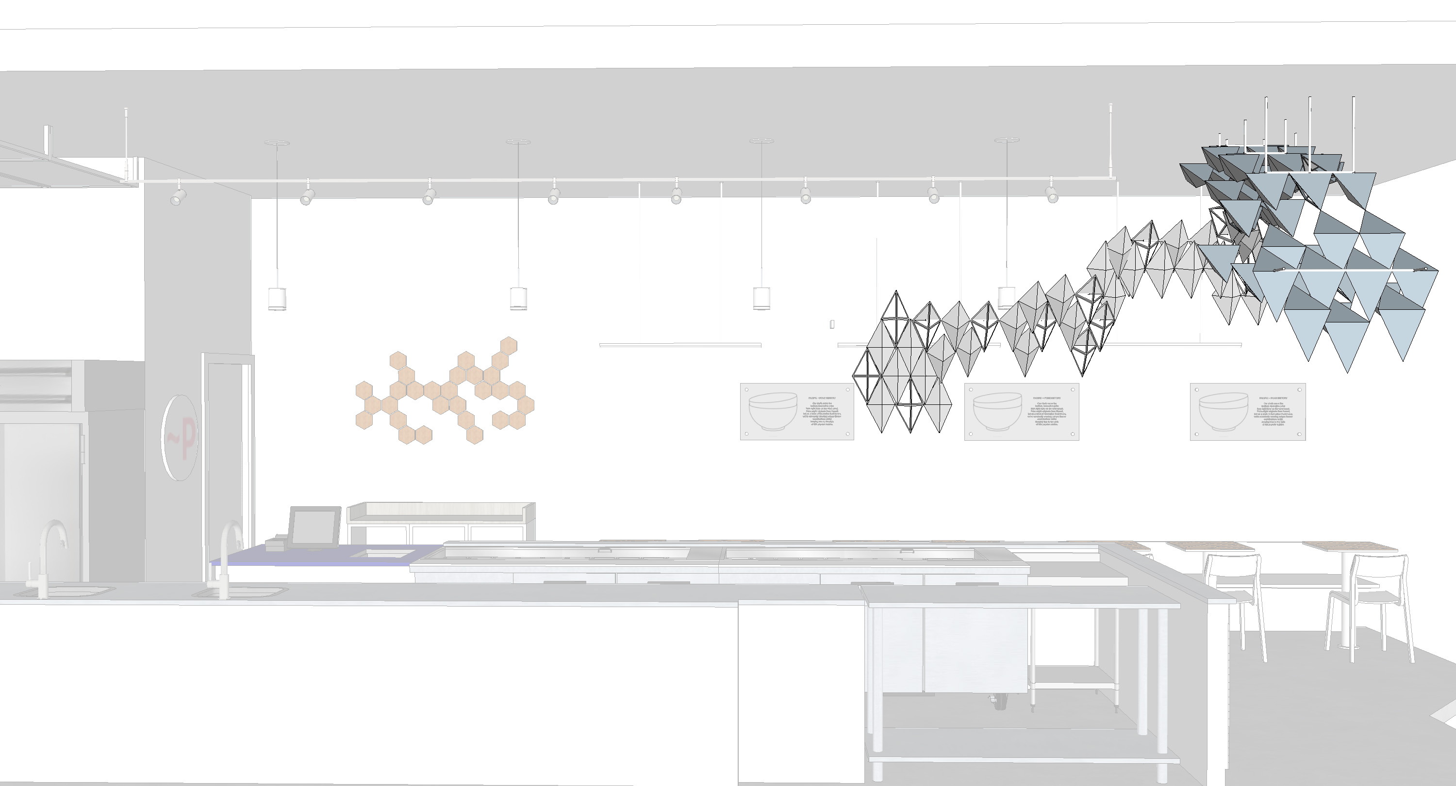
In response to the relatively small footprint of the restaurant, white and light-toned colours were used on the walls, furniture and furnishings, cabinetry and other materials throughout the interior. These colours visually expand the space and avoid the sentiment of being confined in a tiny room. Furthermore, white and light tones help to focus the attention on the company's brand colours and the primary design element.
Triangular metal elements create an abstract wave pattern on the walls and ceiling that serve as a focal point for the whole interior. As these elements undulate, they remind the customers of the ocean and the fresh ingredients that the restaurant uses in their poke bowls.
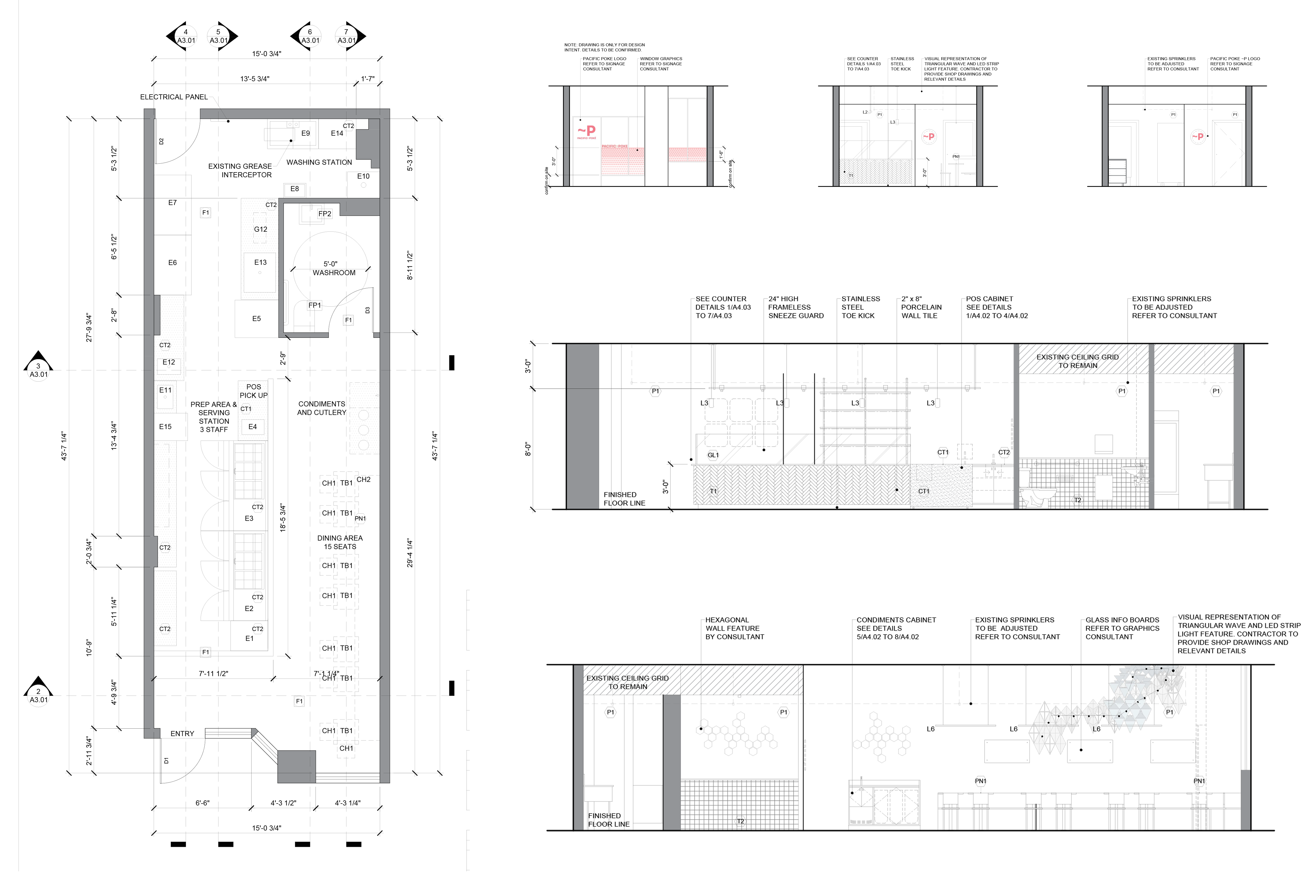
An efficient flow that avoids creating a bottleneck was another concern. This is achieved through a linear progression of activities, which is dictated by the steps in creating the bowls and customized orders. The layout of the ingredients in the refrigerated prep tables also reflects this progression of activities, which helps to avoid confusion among the staff.
Maximizing the space is realized by providing the minimum allowable clearances for hallways, distances between furniture, and cabinet width and depth. This approach helps to accomplish two things: maximum seating and efficient flow of staff and customers.


